The classification algorithm makes a split (at a decision threshold) so that each side after split is as homogeneous as possible. At different decision thresholds, the ROC curve plots true positive rate and false positive rate
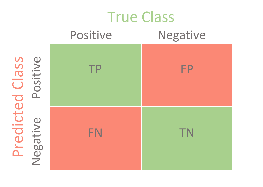
False Positive Rate: The ratio between the False Positives and the total count of observations that should be predicted as False. This is equivalent to 1-specificity
Usage
Curves that fall above the ROC Curve of a random classifier (the diagonal line) are good or decent. The higher up they are (i.e. the closer they are to the curve of the elusive perfect classifier), the better.
Code
import matplotlib.pyplot as pltfrom sklearn.metrics import RocCurveDisplay# ROC curveRocCurveDisplay.from_predictions(y_test, y_pred)plt.show()
Area under ROC curve (or AUC) provides an aggregate measure of performance across all possible classification thresholds.
It is the probability that the model will rank a randomly chosen positive example more highly than a randomly chosen negative example.
AUC ranges in value from 0.0 to 1.0.
AUC of 0← 100% wrong
AUC of 1 ← 100% correct
An AUC smaller than 0.5 indicates that the model performs worse than a random classifier (i.e. a classifier that randomly assigns each example to True or False), and an AUC larger than 0.5 indicates that the model performs better than a random classifier.